
Brisbane 2028
Role
Concept
Designer
Animator
In this project, I created a branding package for a rebrand of the 2028 Olympics set in Brisbane, Australia instead of LA.
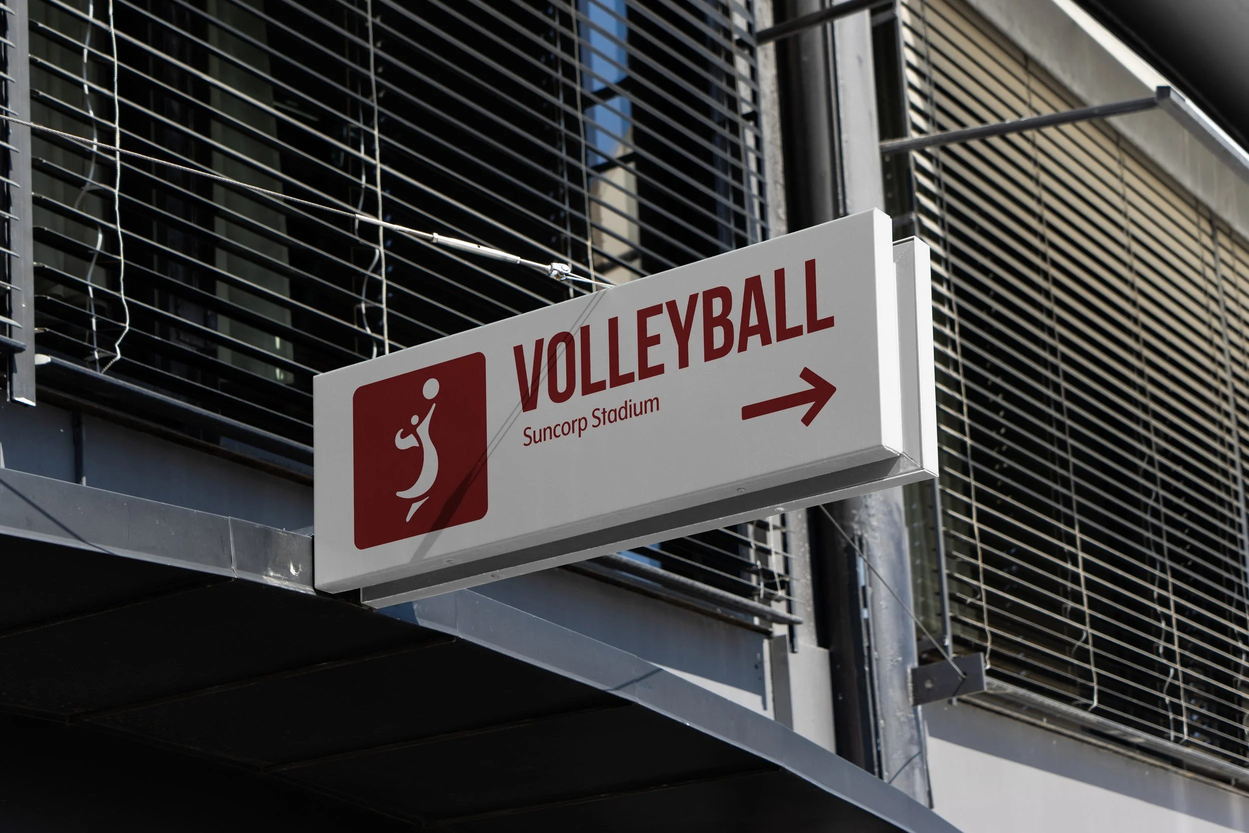
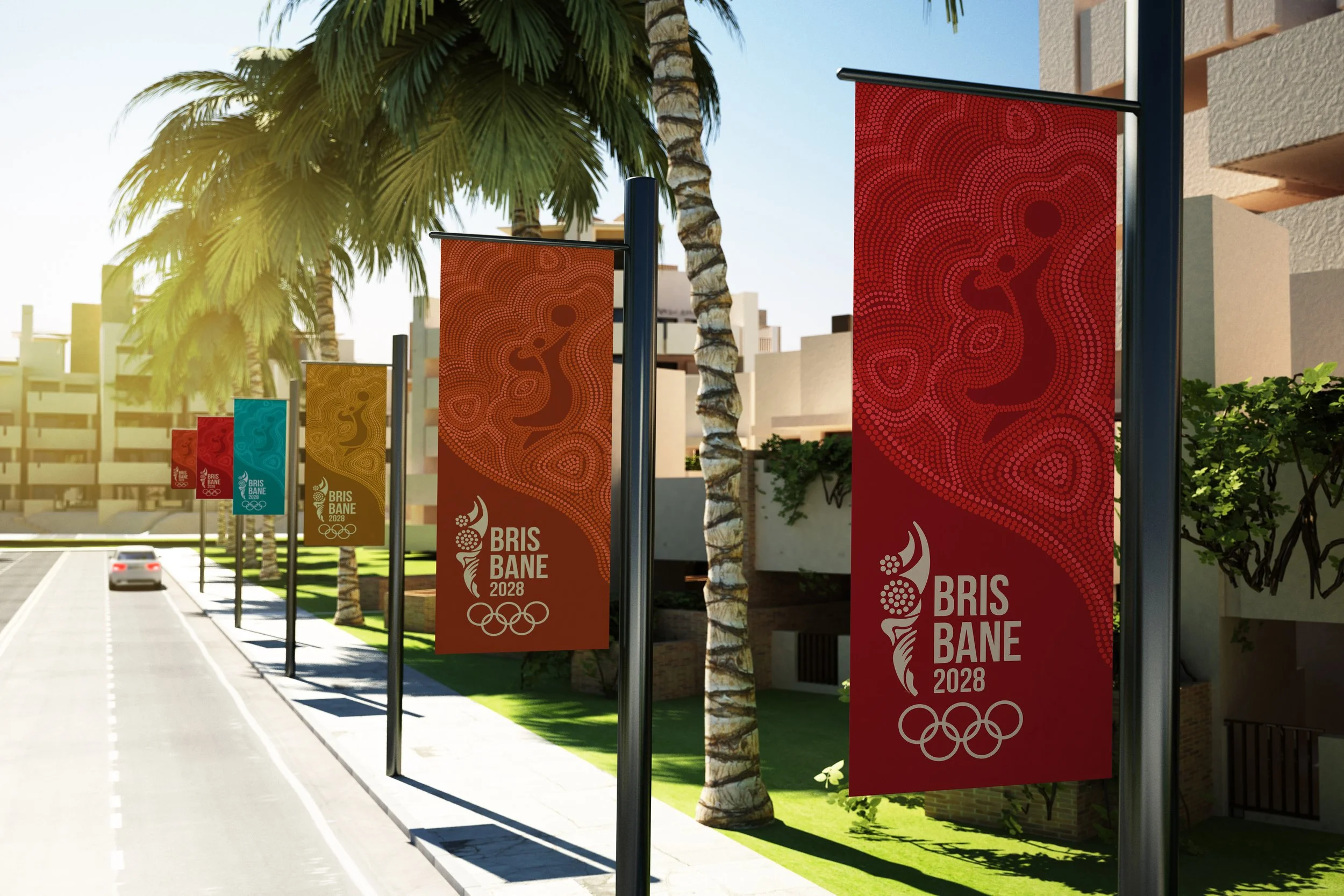
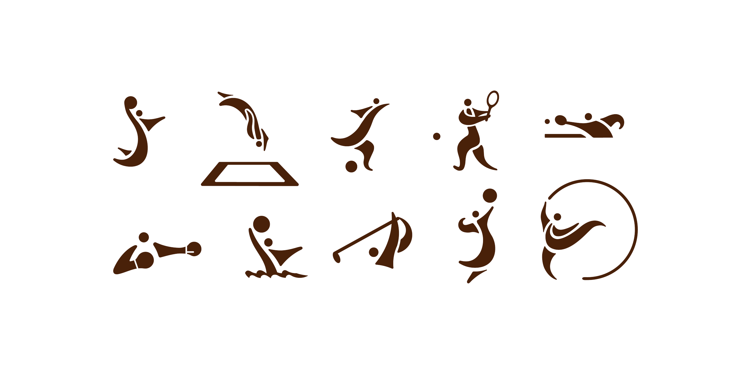
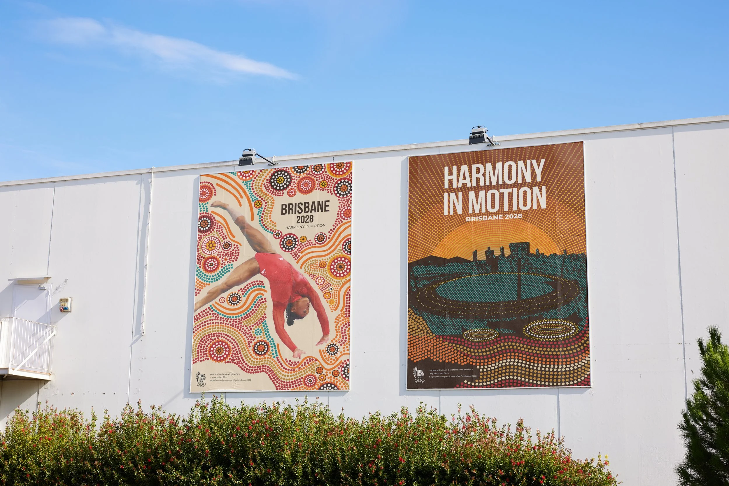
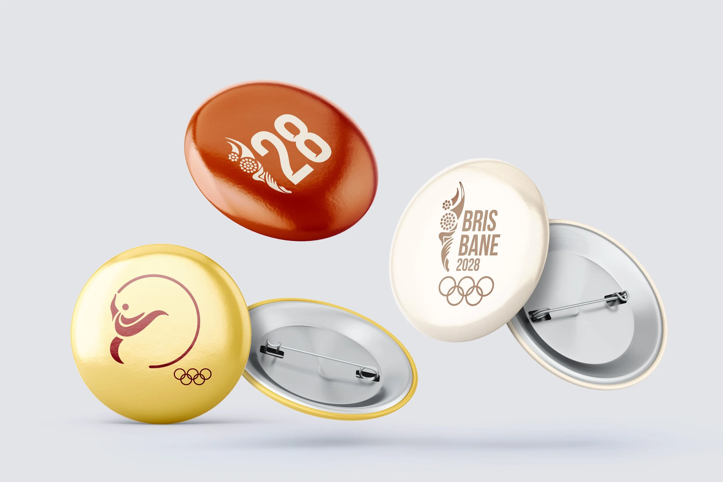
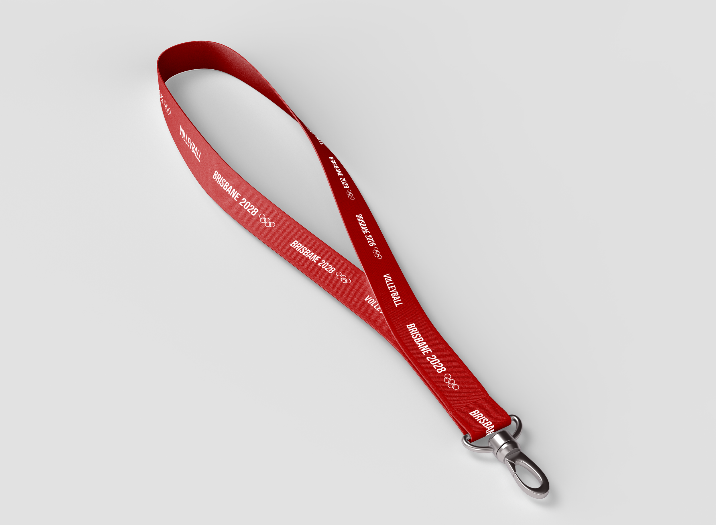
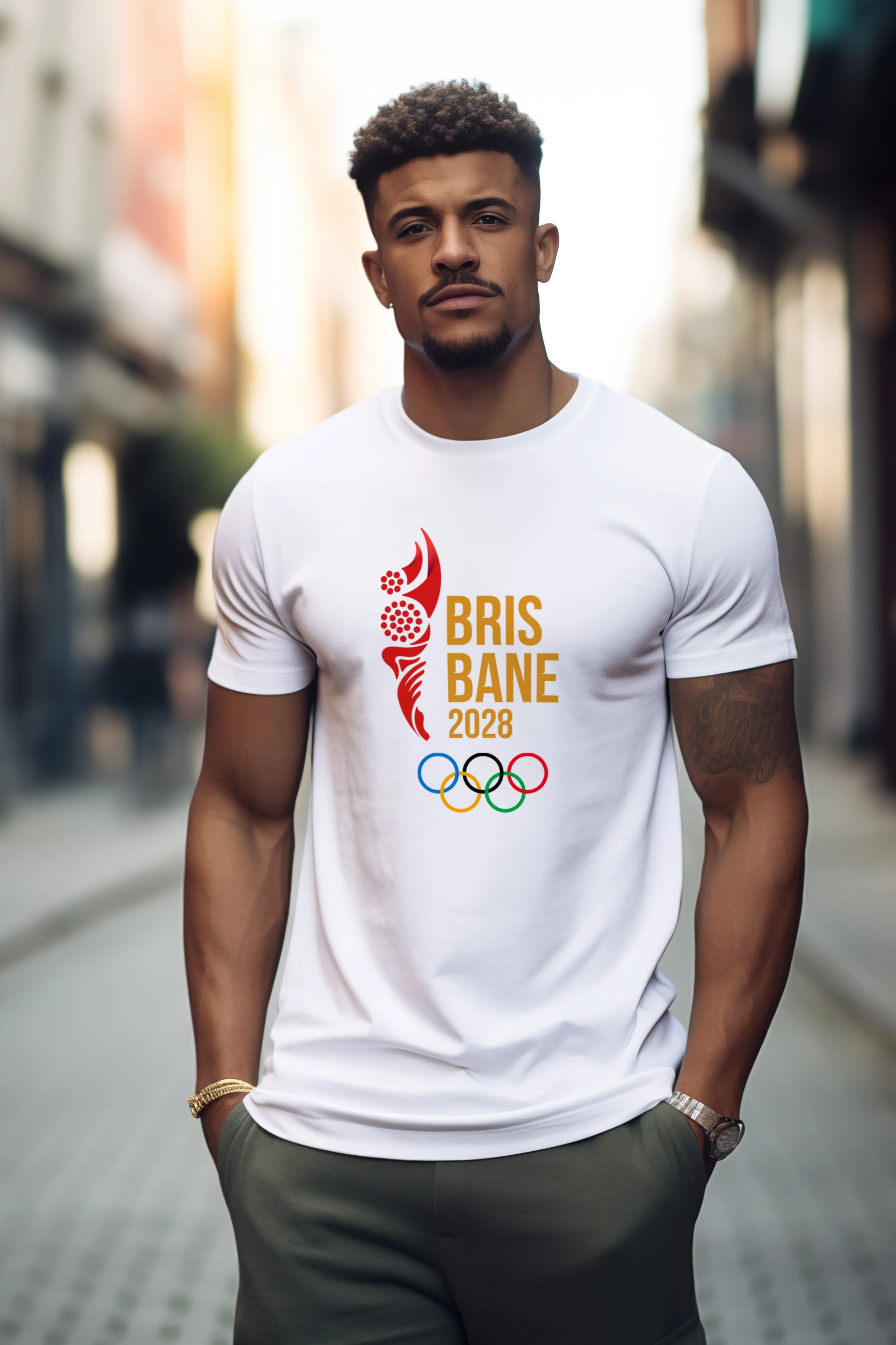
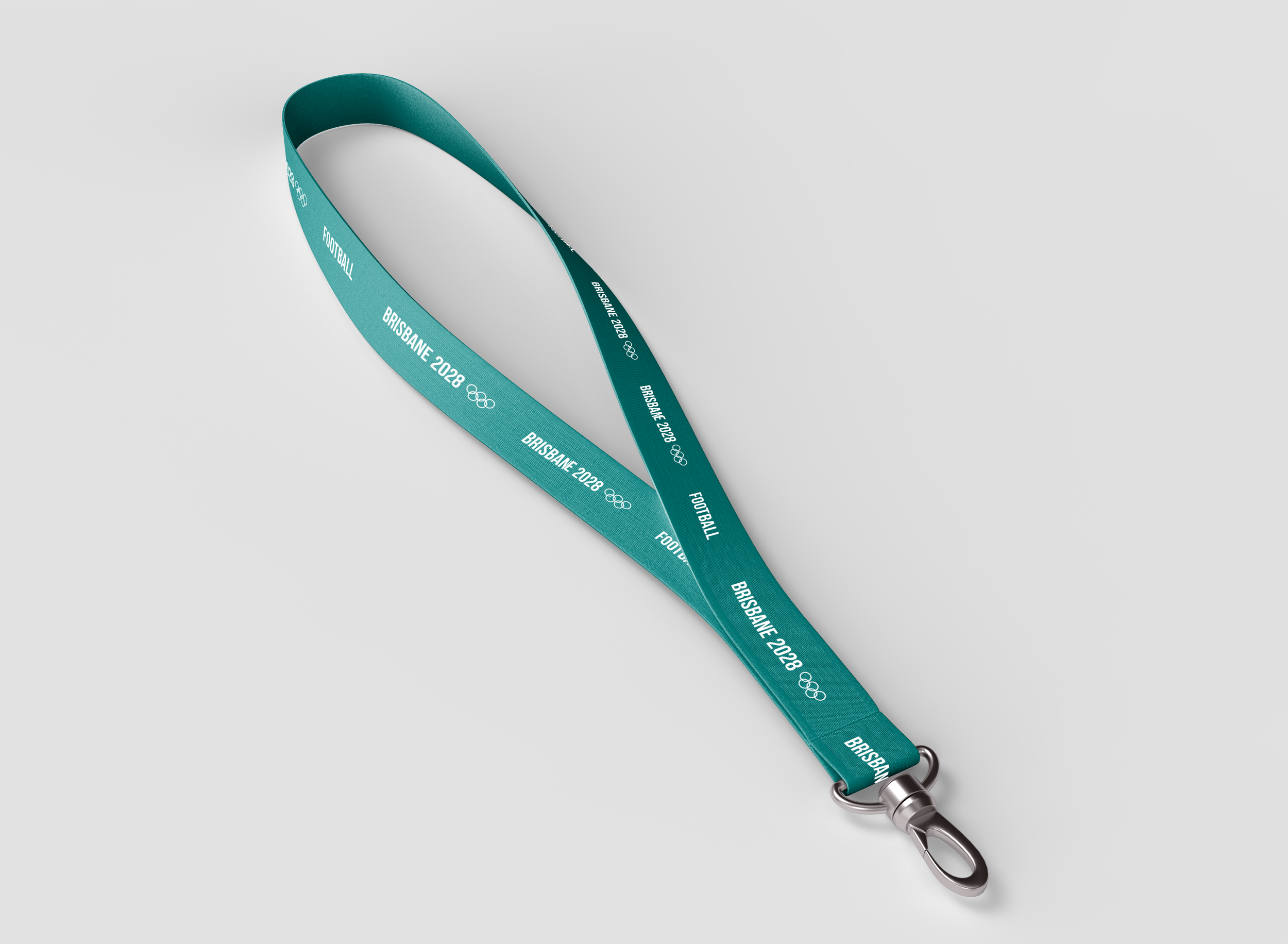
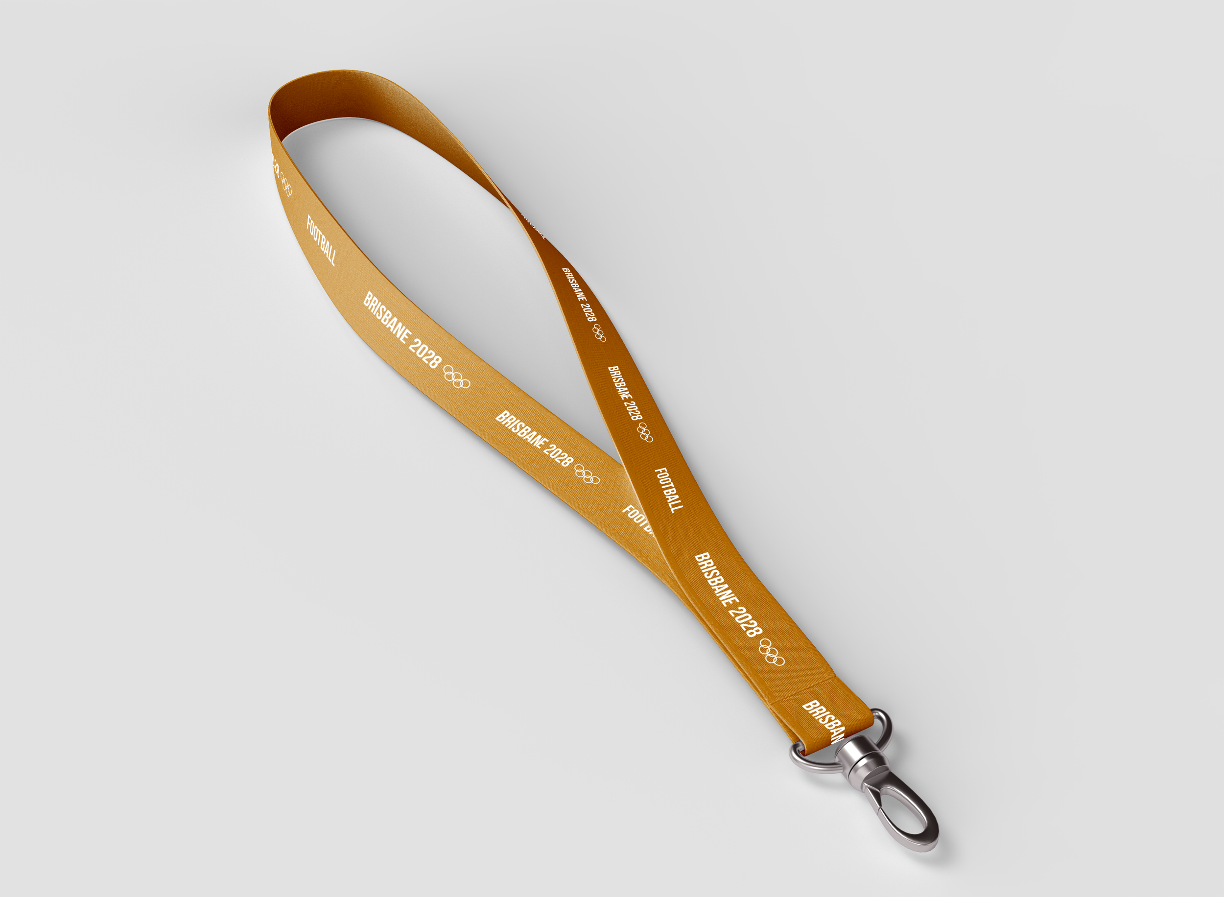
The design harkens back to the Australian’s aboriginal heritage, incorporating dot patterns from their well-known paintings. These create fluid movements, inspiring the slogan: harmony in motion. The pictograms are inspired by figures from native paintings. The color palette echos the vivid Australian flora and fauna. Red conveys the excitement of the games while gold shows the prestige of being an olympian.


color palette
SECONDARY & TERTIARY lockups
SECONDARY
TERTIARY
ICON ALONE
ISOLATION AREA & MINIMUM SIZE
ISOLATION AREA
MINIMUM SIZE
117 X 153 PX

PRIMARY & SECONDARY TYPEFACES
Dusty Red
#DB1818
R219, G24, B24
C8, M100, Y100, K1
PODIUM Gold
#E19723
R255, G151, B35
C11, M44, Y100, K0
DESERT
ORANGE
#FF6700
R255, G103, B0
C0, M74, Y100, K0
REEF TEAL
#00ABA9
R0, G171, B169
C72, M9, Y38, K0


How does she do it?
RESEARCH & EXPLORATION
Environment, Cultural Values, Heritage

Many directions: including wordmarks and icons. Icons of torches, sun, architecture, dot patterns, nature, and dynamic movement
Thumbnail Sketches

SKETCH TO FINAL LOGO ICON
Careful refinement from raw sketch to proportioned, organic shapes

Raw Sketch

Cleaned Sketch

Constructing Golden Ratio Measurements

Golden Ratio Results

Golden Ratio Circles Applied to Create Final Icon