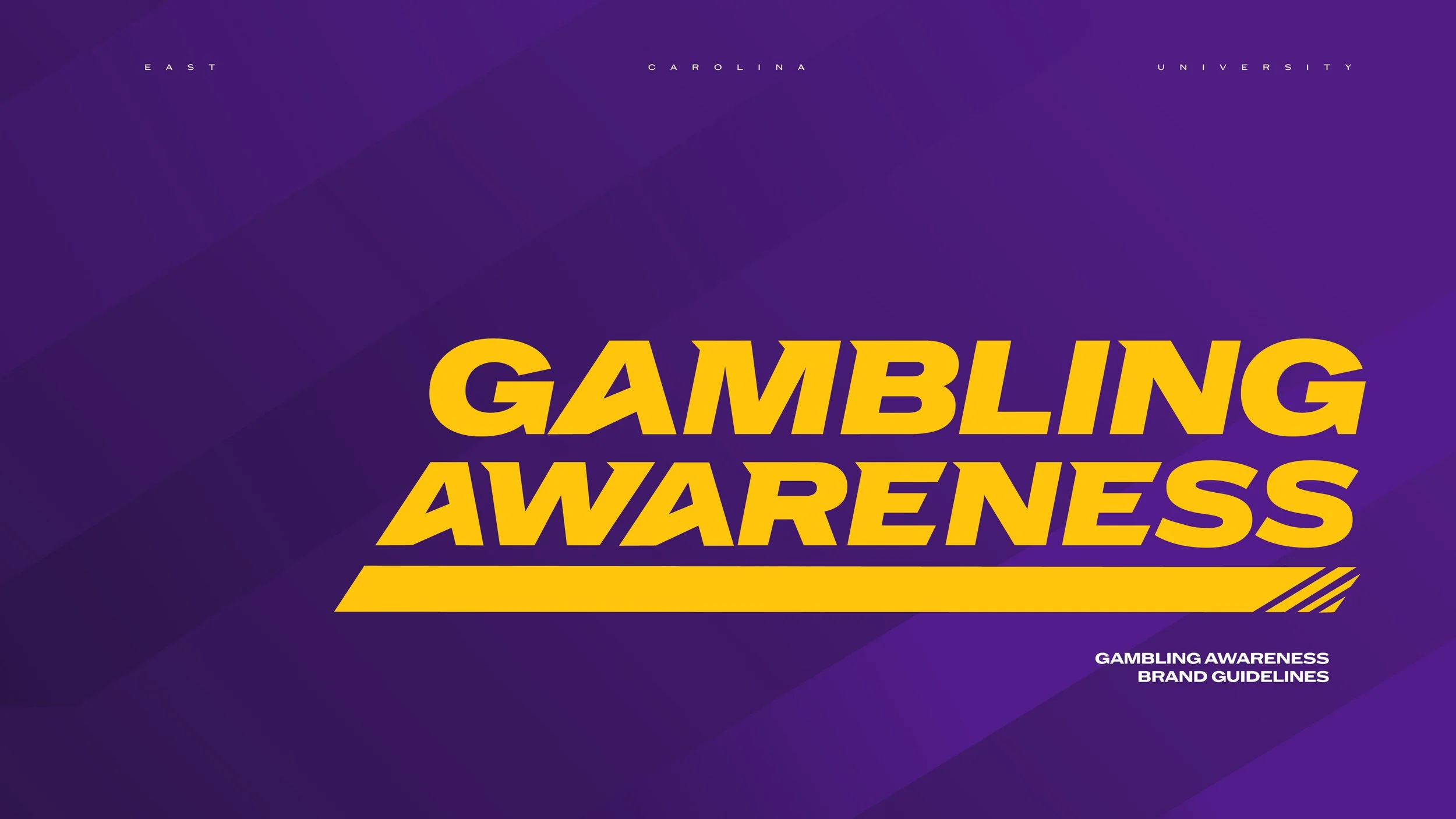
GAMBLING AWARENESS
Role
Concept
Brand Design
Animation
Product Design
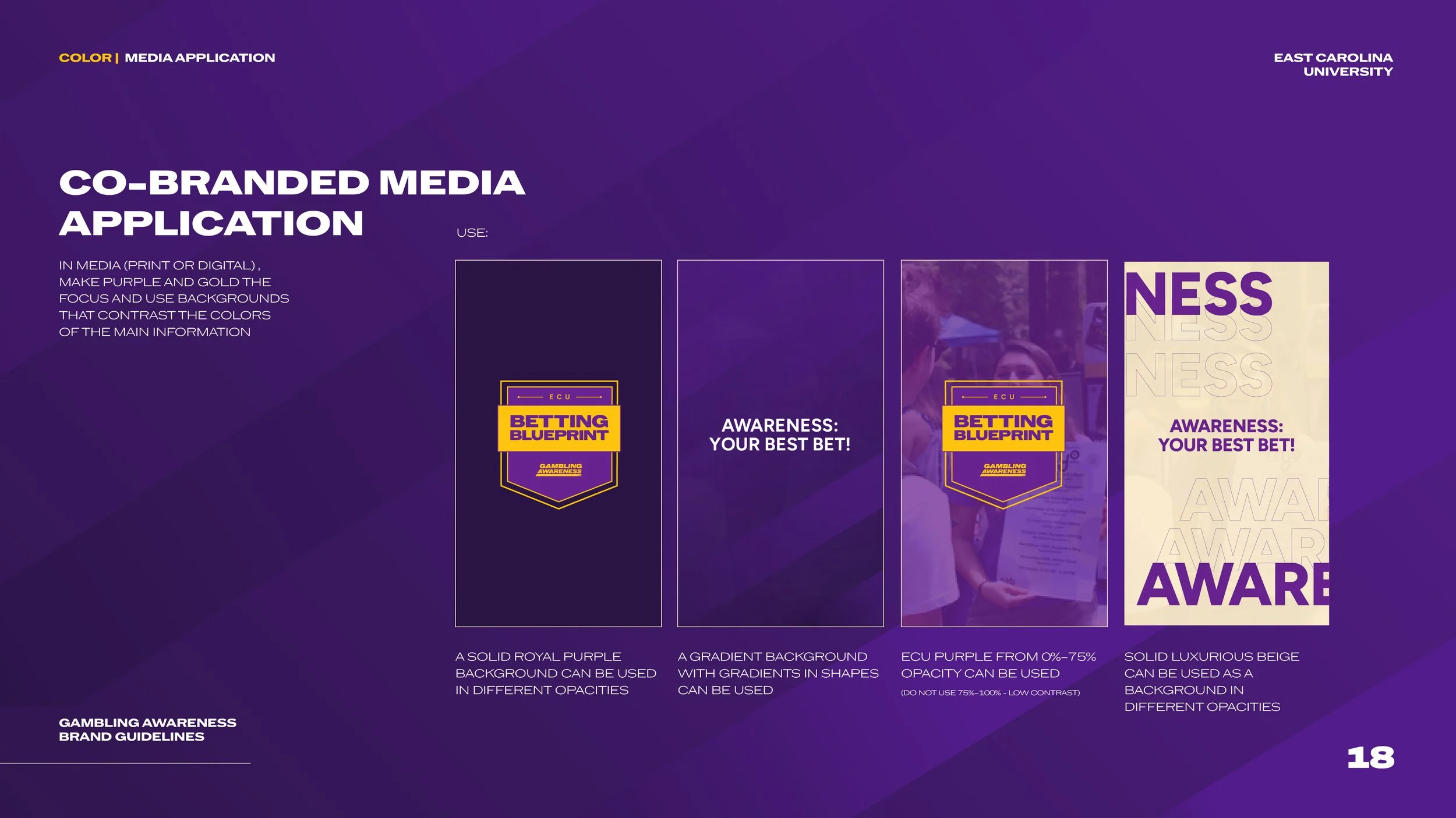
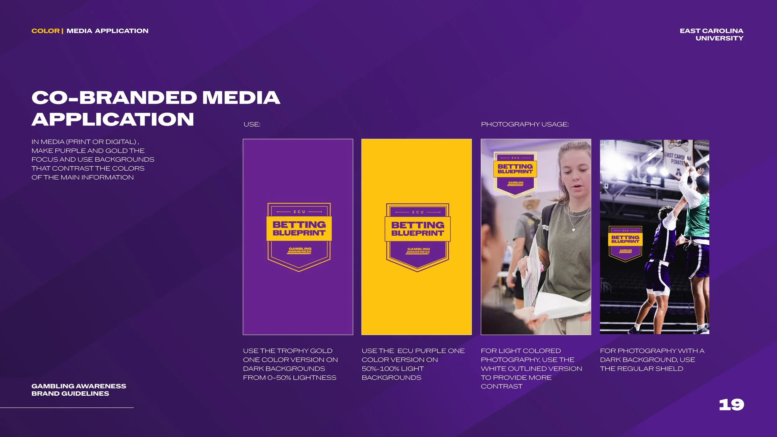
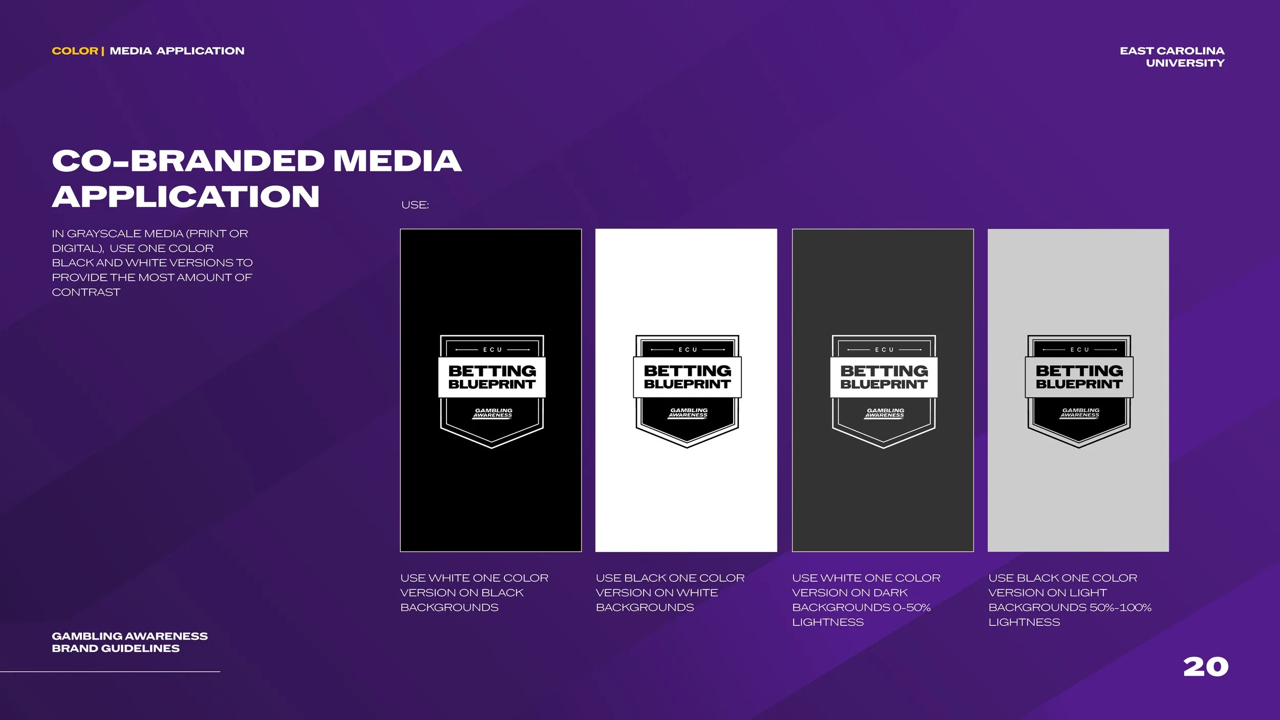
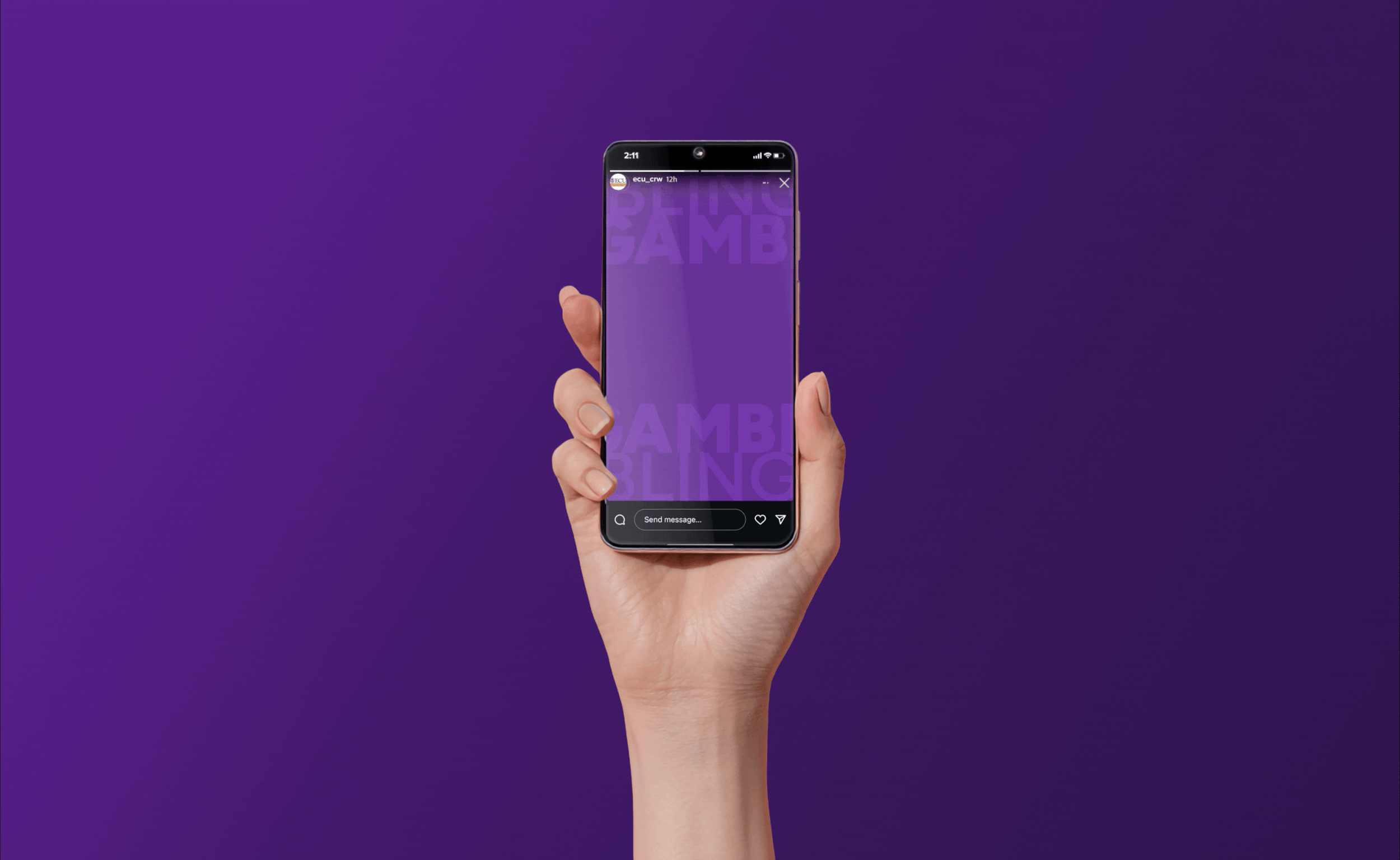
In this campaign, ECU Well-Being desired to educate the student body about the dangers of gambling with a brand that felt similar to sports teams their audience already roots for.
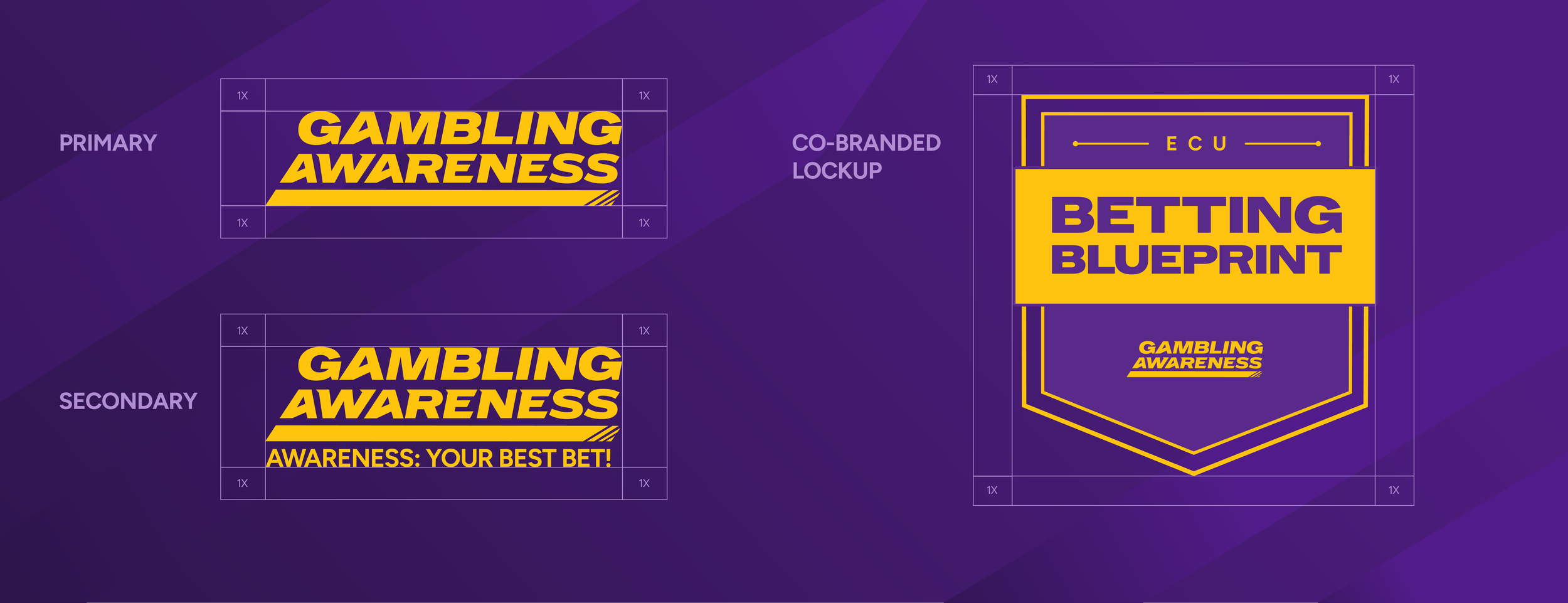
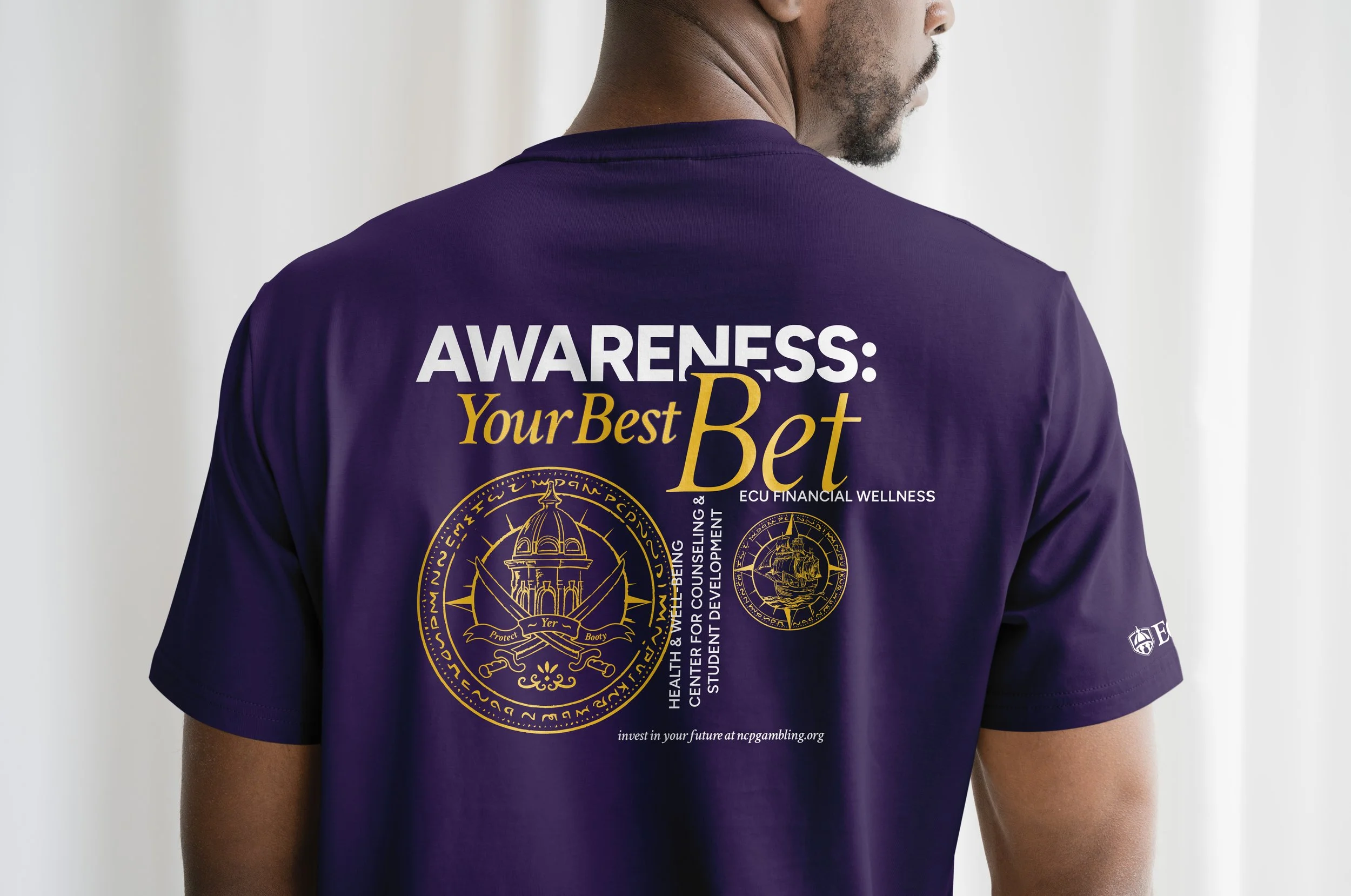
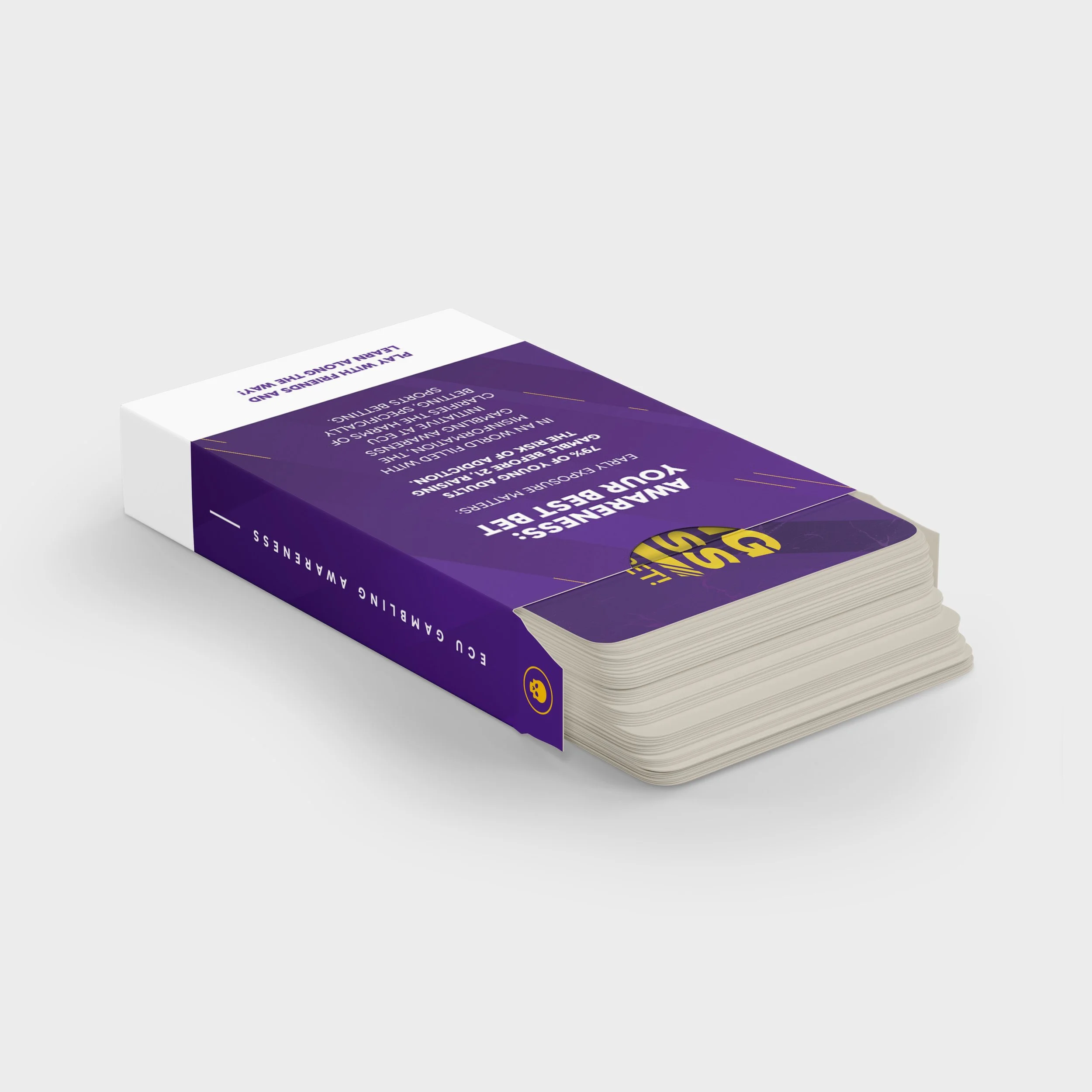
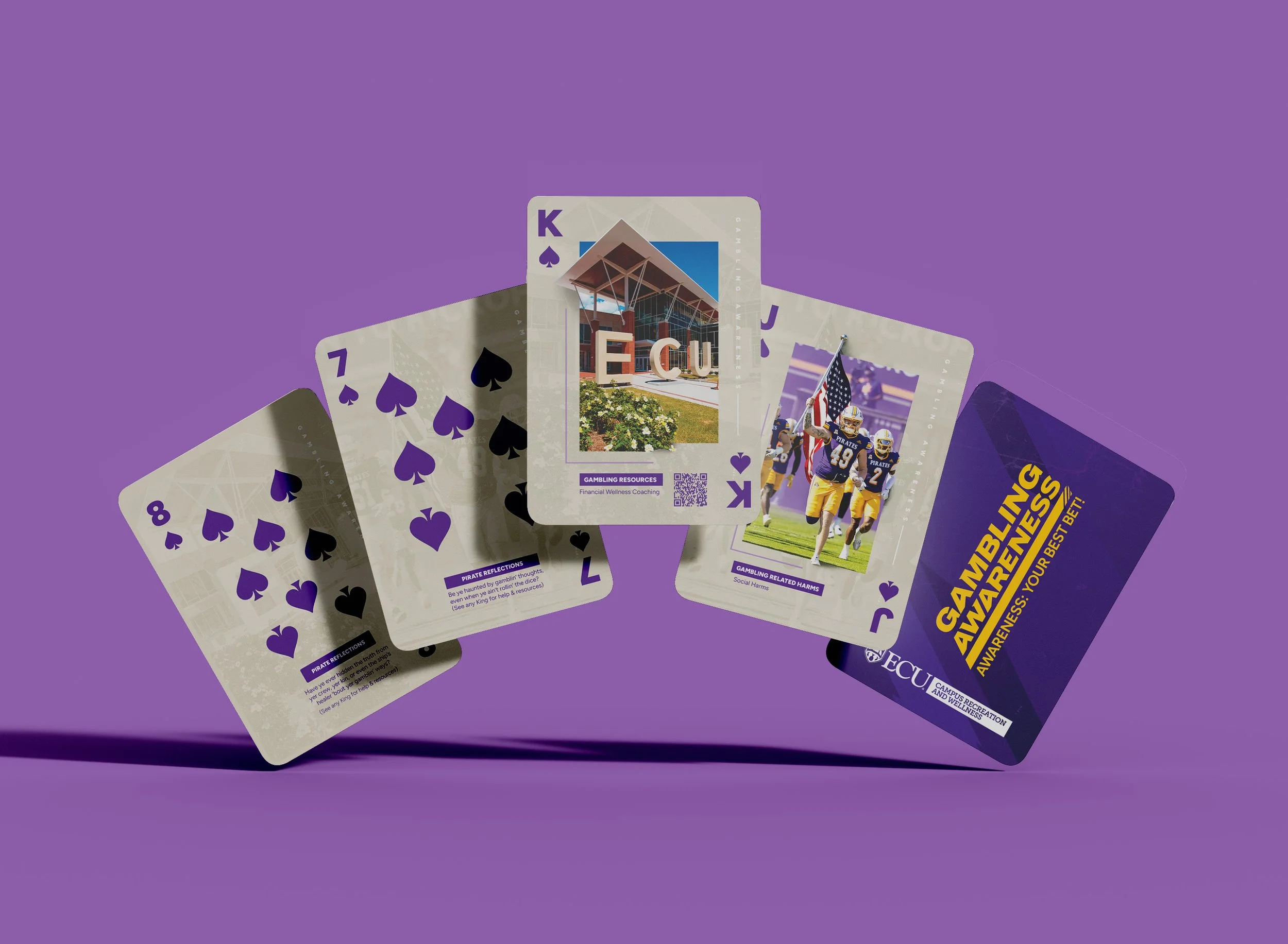
Accomplishing this, I created a logo and co-branded lockup system that encapsulates the essence of the overarching brand: Gambling Awareness, and marketed the individual program offerings.
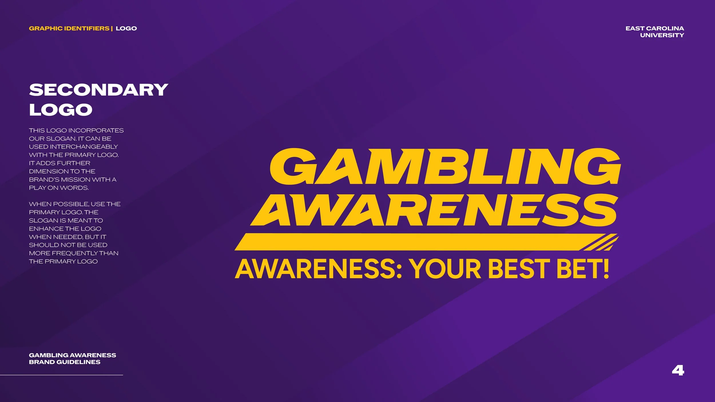
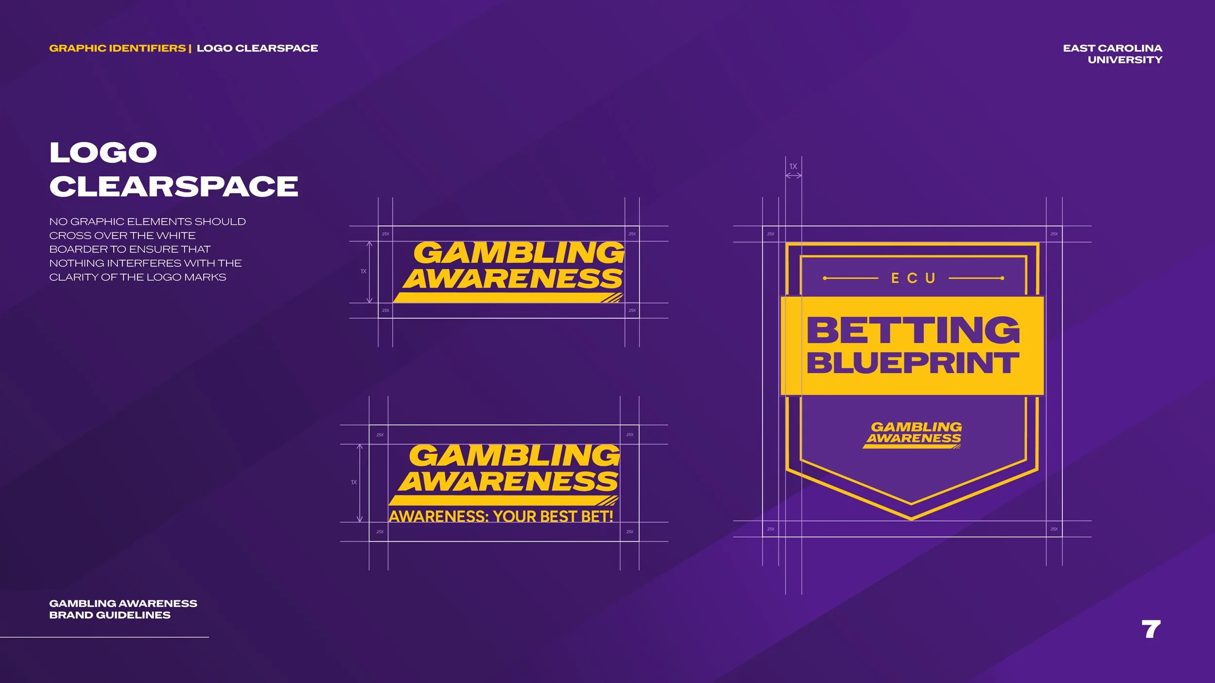
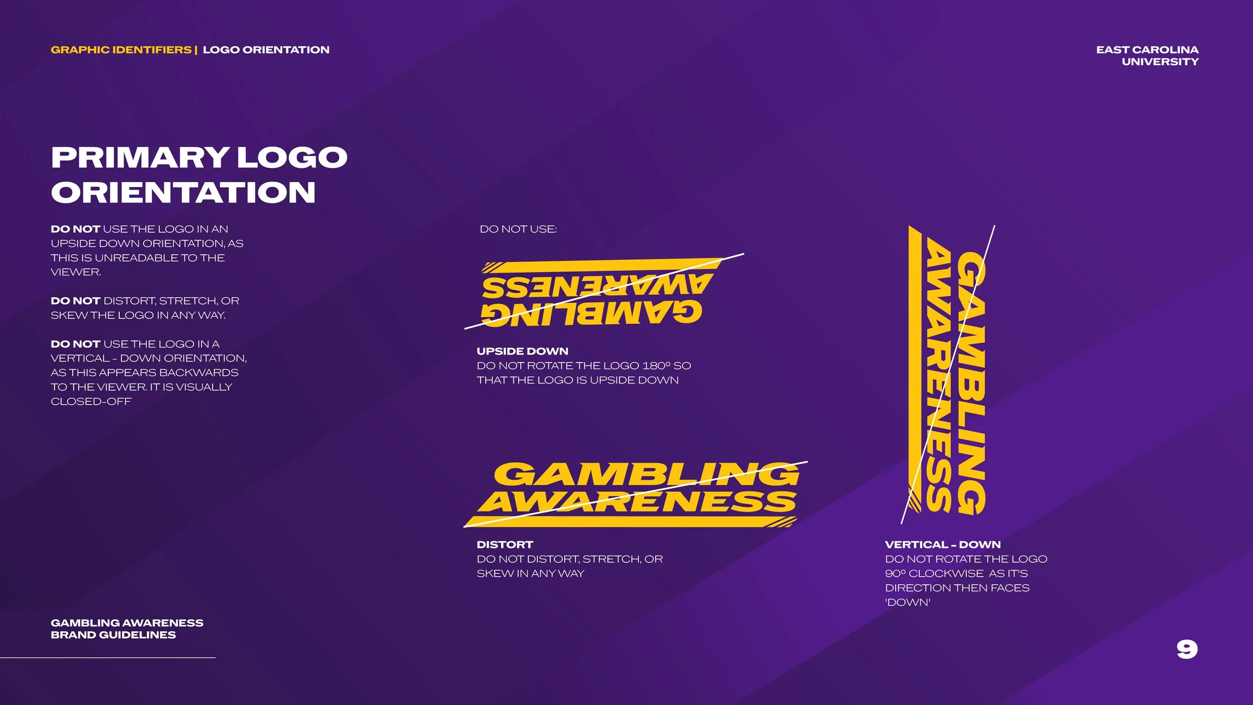
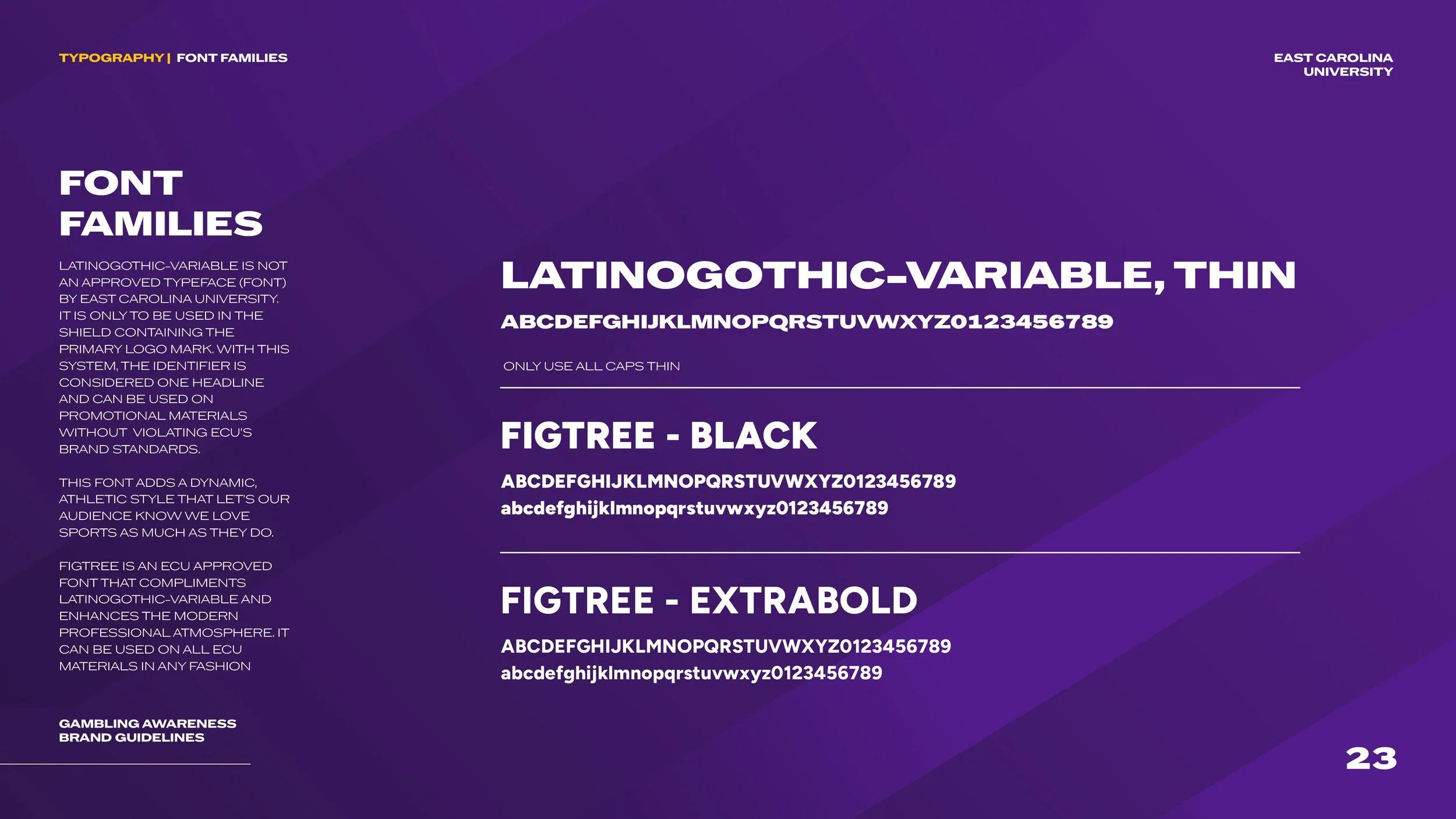
The Gambling Awareness wordmark has a large x-height and an angular tilt, giving it speed and distinct character. The singular winged serifs on the left side and the angled counterform inside the A enhance the feeling of flight. The underline punctuates this dynamic movement.
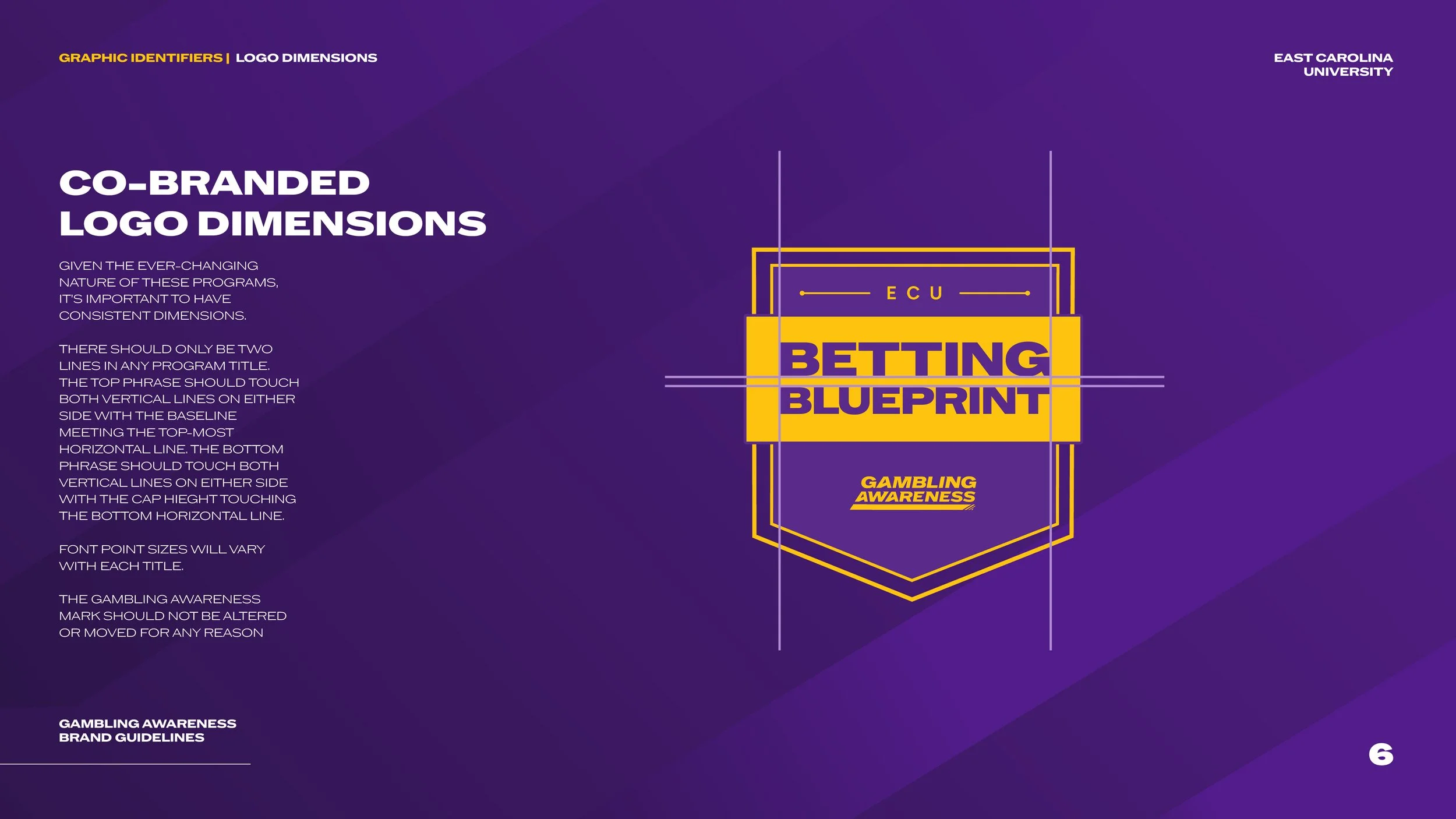
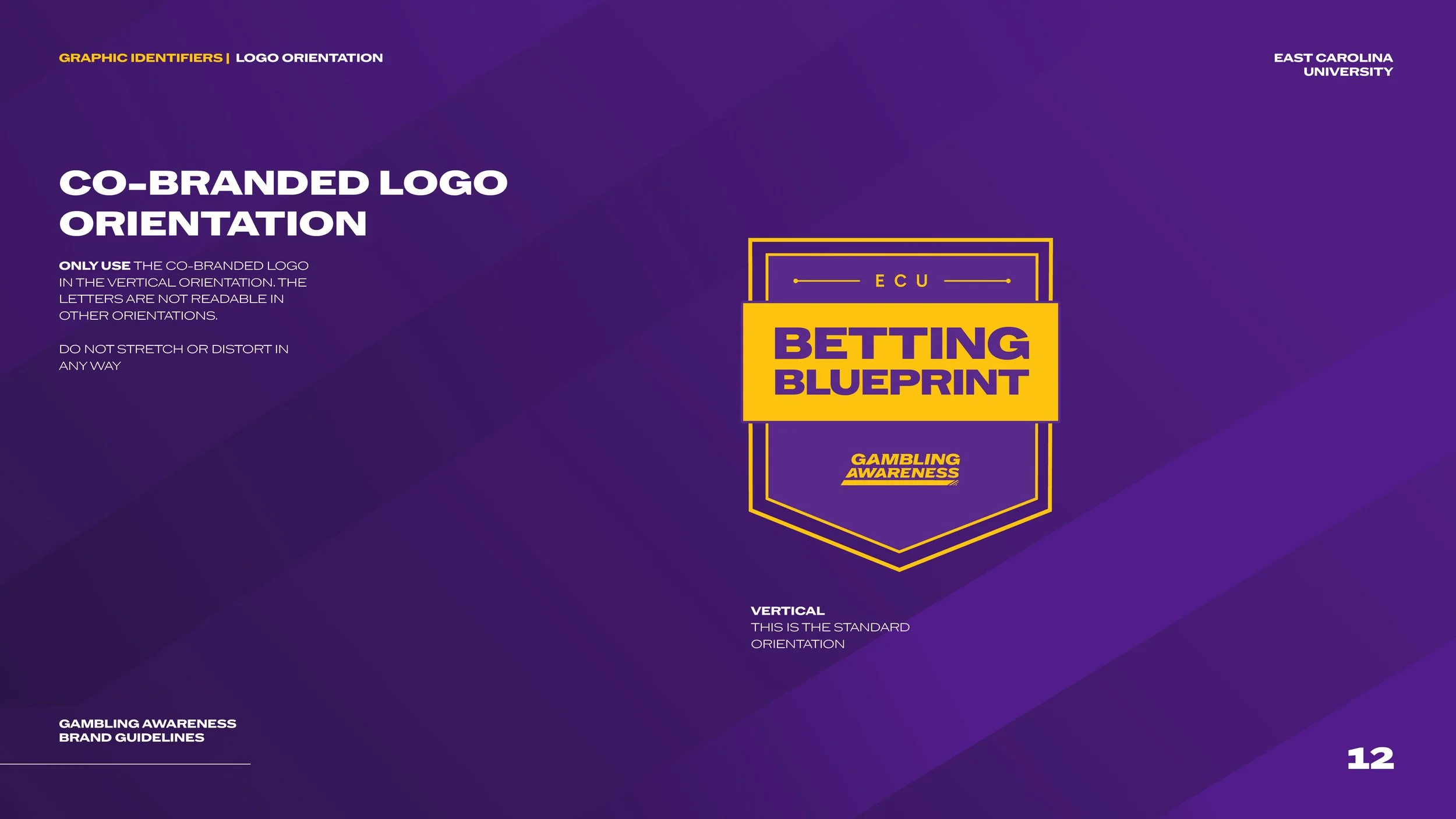
The shields’ program titles use the same font that the wordmark originated from. I implemented hierarchy by highlighting the title while the Gambling Awareness campaign logo sits below.
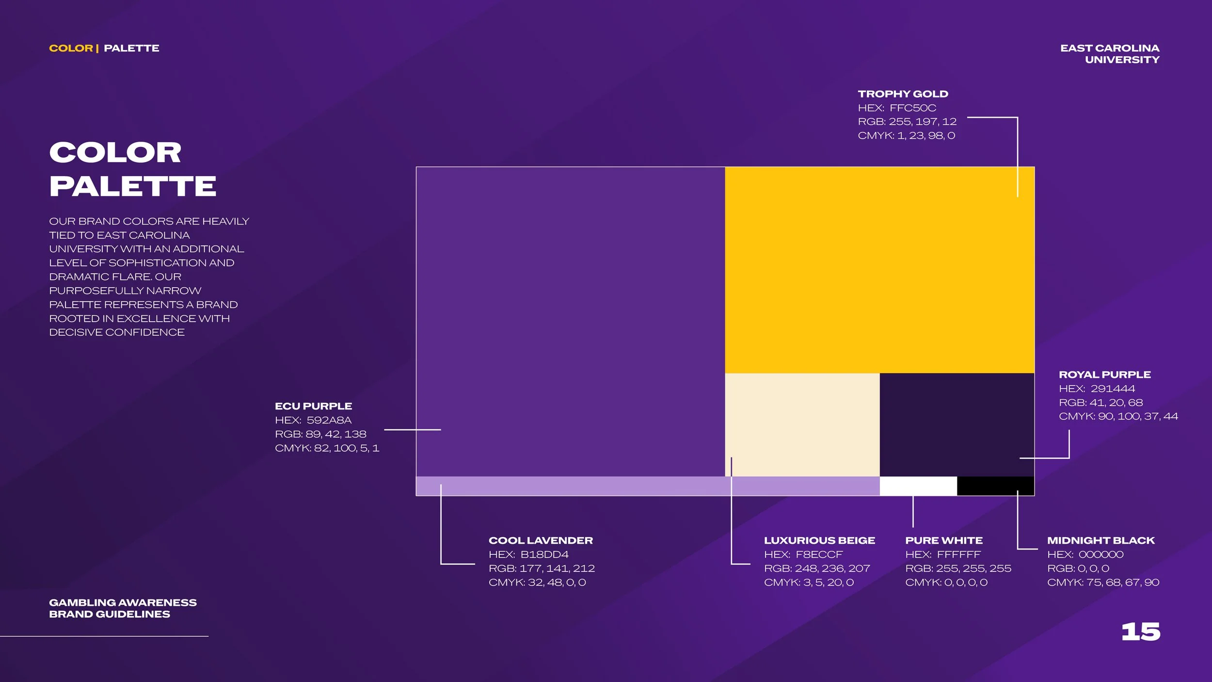
color palette
BRAND GUIDELINES
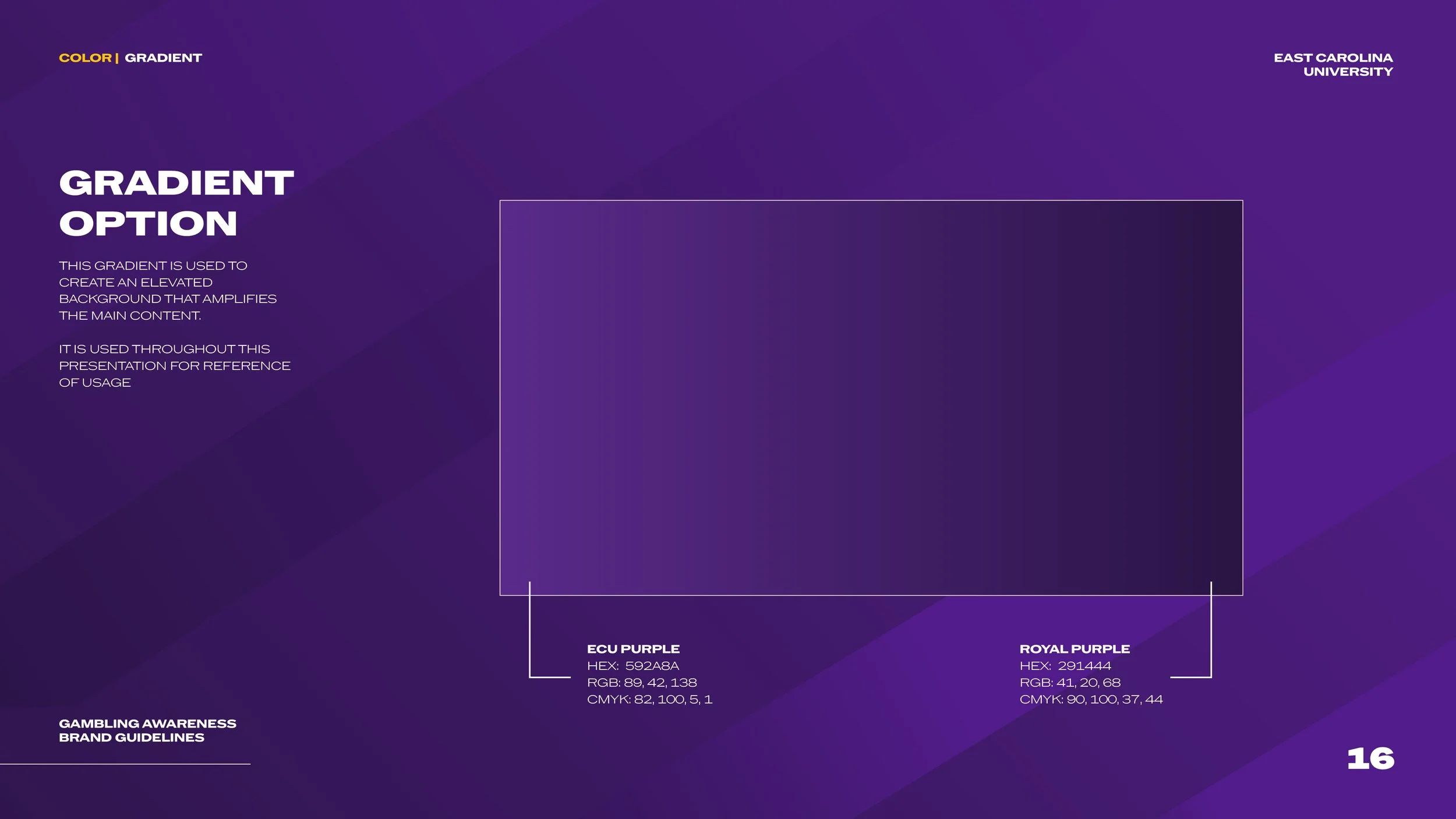
ECU PURPLE
#592A8A
R88, G42, B137
C82, M100, Y0, K12
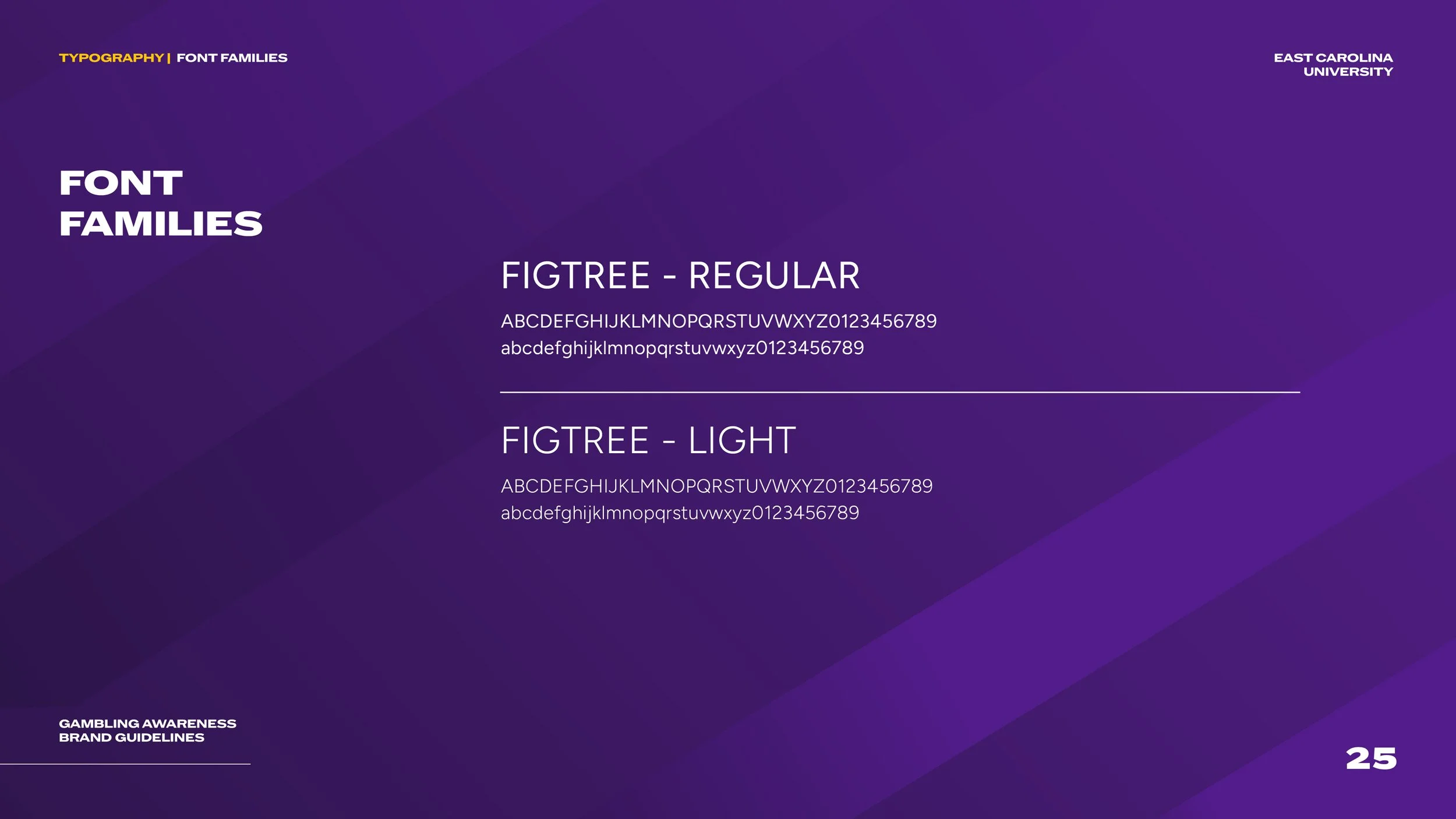
TYPOGRAPHY
MIDNIGHT BLACK
#000000
R0, G0, B0
C75, M68, Y67, K90
Trophy Gold
#FFC50C
R255, G197, B12
C1, M23, Y98, K0
ROYAL PURPLE
#291444
R41, G20, B68
C90, M100, Y37, K44
LUXURIOUS BEIGE
#F8ECCF
R248, G236, B207
C3, M5, Y20, K0
PURE WHITE
#FFFFFF
R255, G255, B255
C0, M0, Y0, K0
COOL LAVENDER
#B18DD4
R177, G141, B212
C32, M48, Y0, K0


BRAND in Action


HOW DOES SHE DO IT?
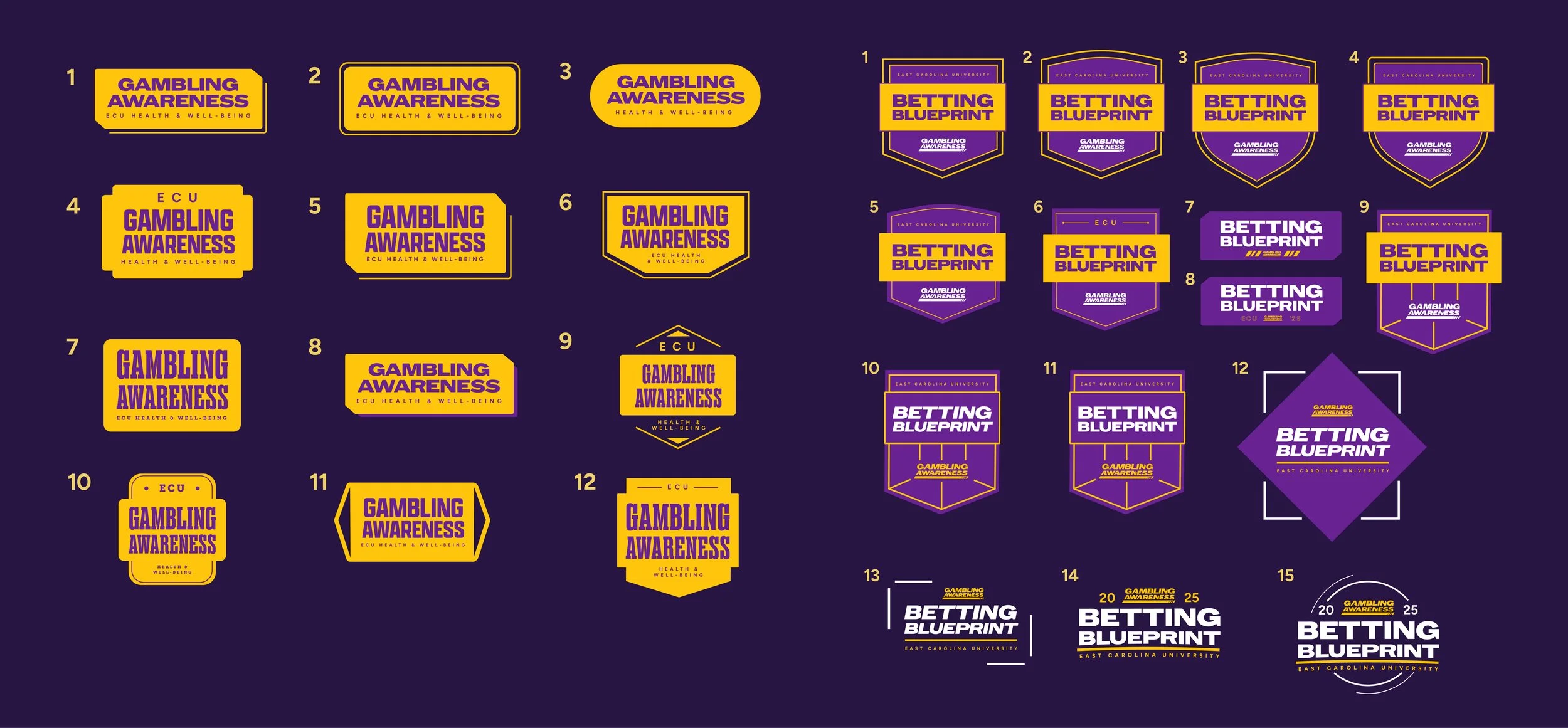
Sketches
Exploration of font and shape options for a central wordmark on the left side (1-12). Exploration of font and shape options for the co-branded shield on the left side (1-15).
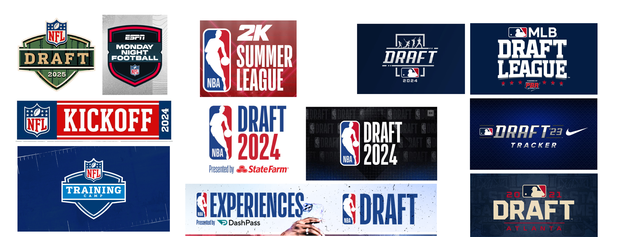
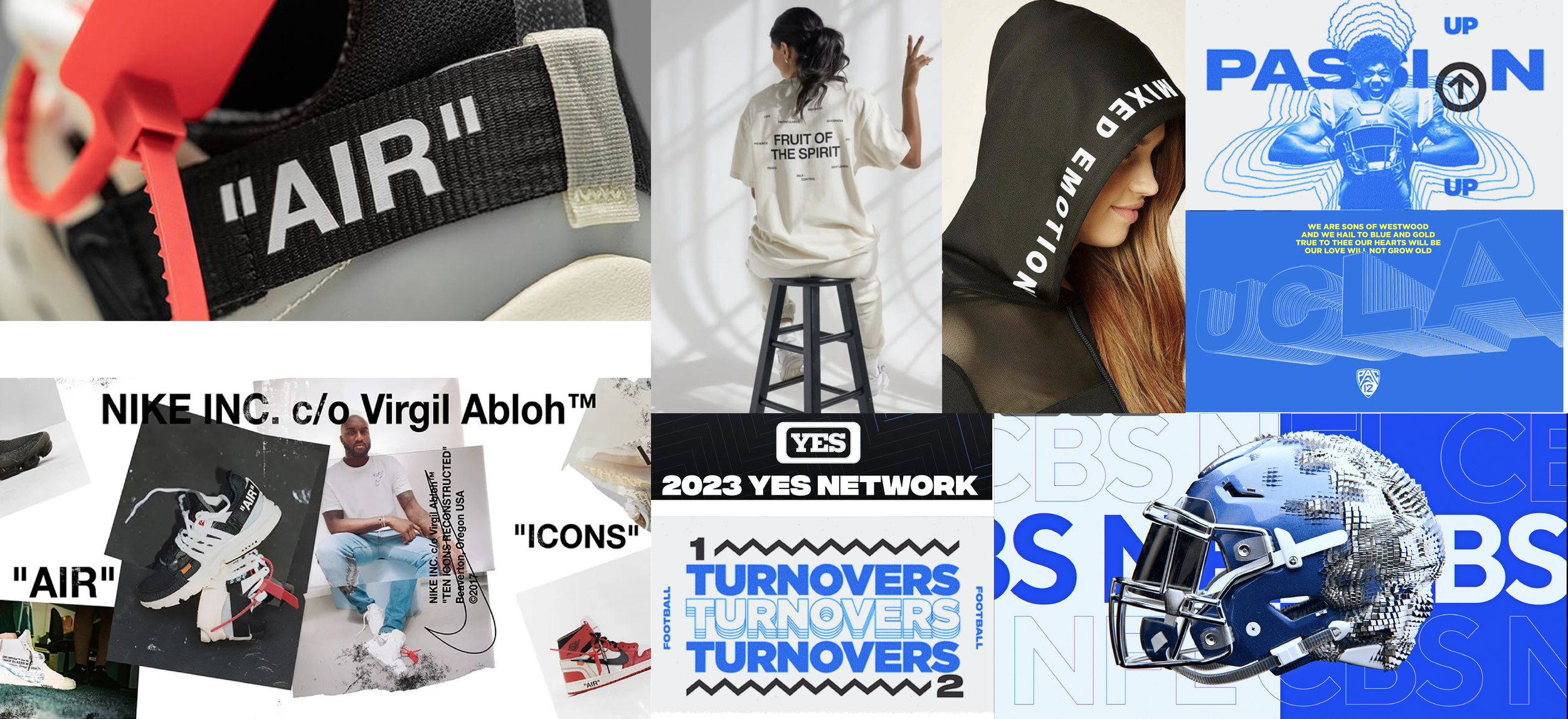
RESEARCH & EXPLORATION
Current sports league naming conventions, fashion, current branding packages for professional sports networks